Cebooze is a growing liquor delivery service looking to stand out in a competitive, convenience-driven market. As more consumers turn to online ordering, the brand needed a stronger and more recognizable identity that goes beyond simply delivering alcohol.
This rebrand focuses on building a brand that represents community, reflects the energy behind its name, and expresses a fun, approachable personality. By refining its visual identity, tone of voice, and overall presence, Cebooze is positioned as a trusted, celebration-ready partner for social moments and gatherings.
Problem:
Cebooze operates in a highly competitive market where liquor retailers and delivery services offer similar products.
Cebooze operates in a highly competitive market where liquor retailers and delivery services offer similar products.
Goal:
Increase Cebooze’s visibility and memorability through a vibrant, modern brand identity rooted in community and connection.
Increase Cebooze’s visibility and memorability through a vibrant, modern brand identity rooted in community and connection.

Team:
Shin, Lead Designer
Veronica, Marketing Manager
Glee, Graphic Designer
Januel, Graphic/Motion Designer
Shin, Lead Designer
Veronica, Marketing Manager
Glee, Graphic Designer
Januel, Graphic/Motion Designer
Deliverables:
Logo Design
Visual Identity
Web Design
Social Media Designs
Logo Design
Visual Identity
Web Design
Social Media Designs

THE PROCESS
Discover > Design > Iterate > Delivery
Discover > Design > Iterate > Delivery
1. Discovery
Understanding Cebooze
Before starting any design work, we begin with a discovery phase to understand what Cebooze truly wants to represent. By reflecting on the company’s values, personality, and goals, we identify what messages the brand needs to communicate and how it can stand out in a crowded market. We explore what the team dislikes about competitors, what makes Cebooze unique, and how these insights can shape a brand identity.
Market Analysis
After the initial inquiry and reflection, we conducted a market analysis to gain deeper insights into Cebooze’s positioning and identity. By examining competitors, industry trends, and customer behavior, we were able to identify opportunities, gaps, and differentiators that would inform the brand’s personality, messaging, and visual identity. This research ensured that the rebrand would not only reflect the company’s values but also stand out effectively in the competitive liquor delivery market.
After the initial inquiry and reflection, we conducted a market analysis to gain deeper insights into Cebooze’s positioning and identity. By examining competitors, industry trends, and customer behavior, we were able to identify opportunities, gaps, and differentiators that would inform the brand’s personality, messaging, and visual identity. This research ensured that the rebrand would not only reflect the company’s values but also stand out effectively in the competitive liquor delivery market.


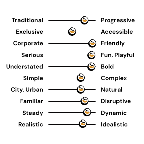
Key Insights
Through the discovery phase and market analysis, we gained a clear understanding of Cebooze’s strengths, opportunities, and the elements that could define its brand identity. The research highlighted how the brand could differentiate itself in a competitive liquor delivery market and connect meaningfully with its audience. We found that Cebooze has the potential to stand out by embracing its local roots, community focus, and fun, playful personality, while appealing to a young, urban audience.
Through the discovery phase and market analysis, we gained a clear understanding of Cebooze’s strengths, opportunities, and the elements that could define its brand identity. The research highlighted how the brand could differentiate itself in a competitive liquor delivery market and connect meaningfully with its audience. We found that Cebooze has the potential to stand out by embracing its local roots, community focus, and fun, playful personality, while appealing to a young, urban audience.
Looking to Stand Out: Cebooze needs a distinct personality and visual presence to rise above generic competitors.
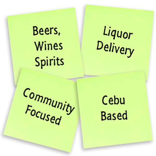
Local Focus: Being Cebu-based is a strength, allowing the brand to connect authentically with the community.
Community-Driven: Emphasizing connection and engagement positions Cebooze as more than a delivery service.
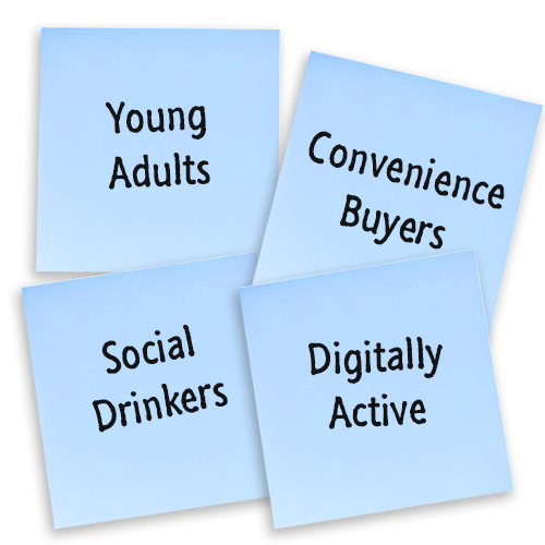
Young Adult Target Market: The primary audience is digitally active, urban young adults who value convenience and social experiences.
Dynamic Identity: The brand should feel energetic, adaptable, and modern to reflect its fast-paced, on-demand service.
Fun and Playful: The personality should be approachable, lively, and celebratory, making Cebooze memorable and enjoyable to interact with.
These insights became the foundation for shaping the brand’s tone, visuals, and overall identity, ensuring it resonates with its audience while standing out in a crowded market.

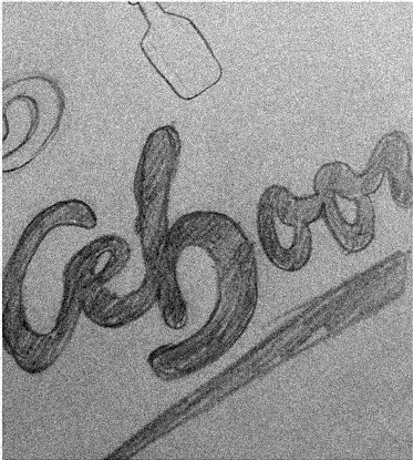
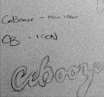
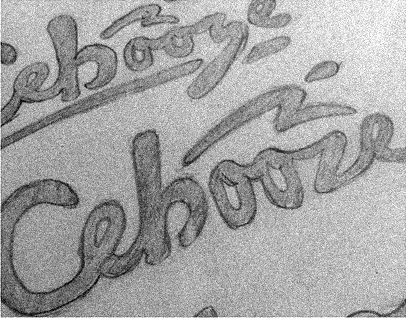
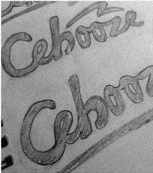
2. Design
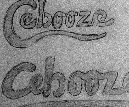
Design Decision for the Logo
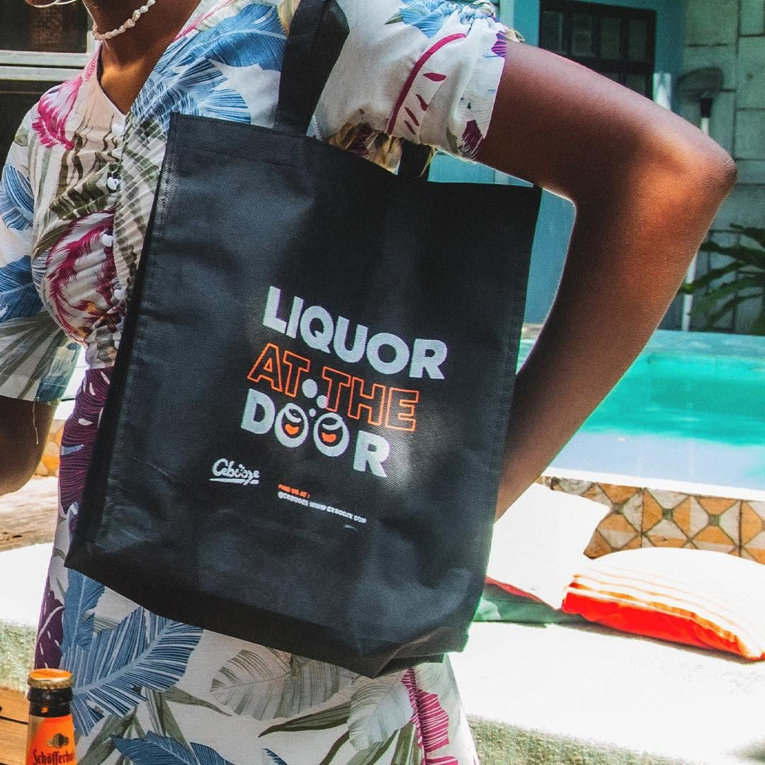
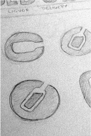
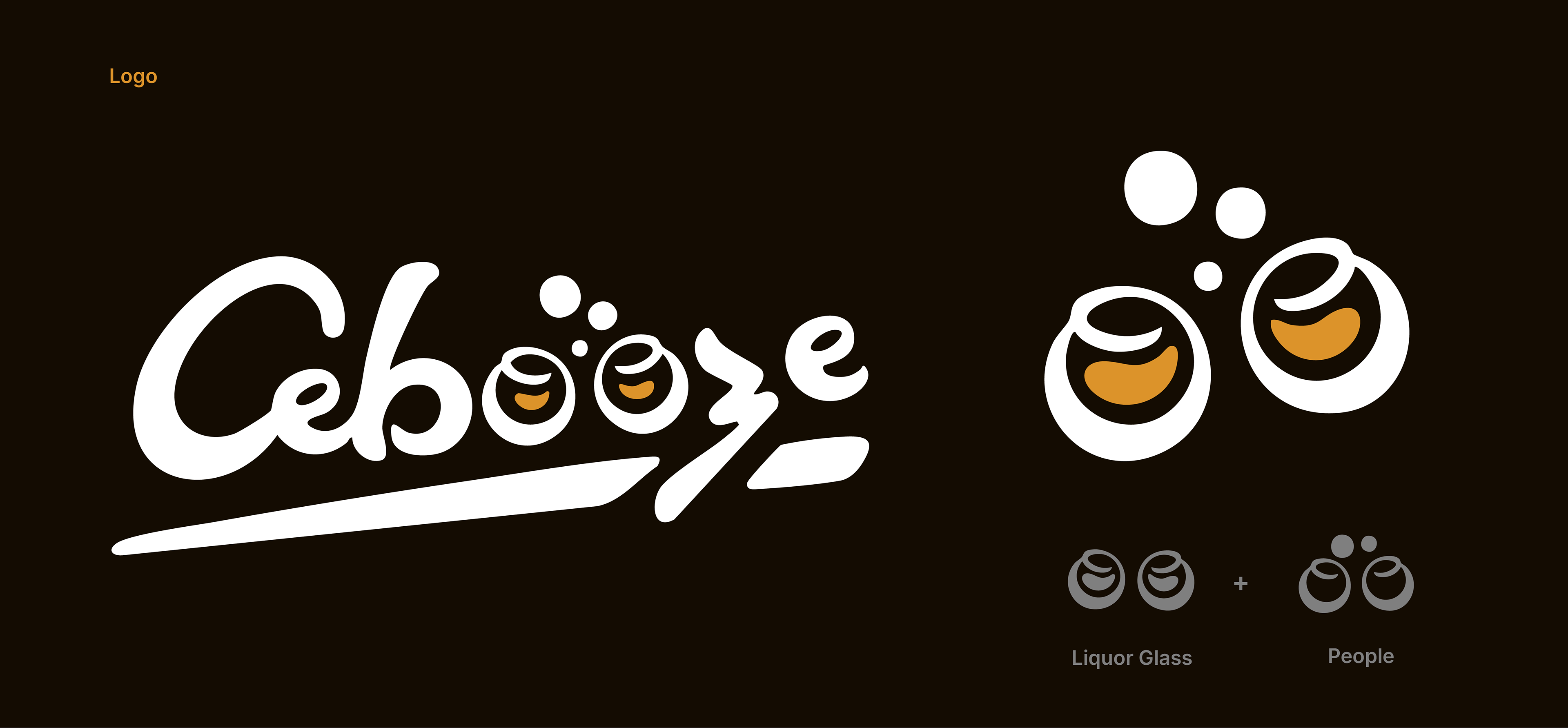
From the start of the rebrand, we knew the name Cebooze had to shine. A wordmark logo was chosen to make the brand name instantly recognizable and memorable, establishing a strong foundation for all visual communications. At the same time, we introduced a flexible and distinctive icon to complement the wordmark. This icon could be used across the website, social media, packaging, and other brand touchpoints.
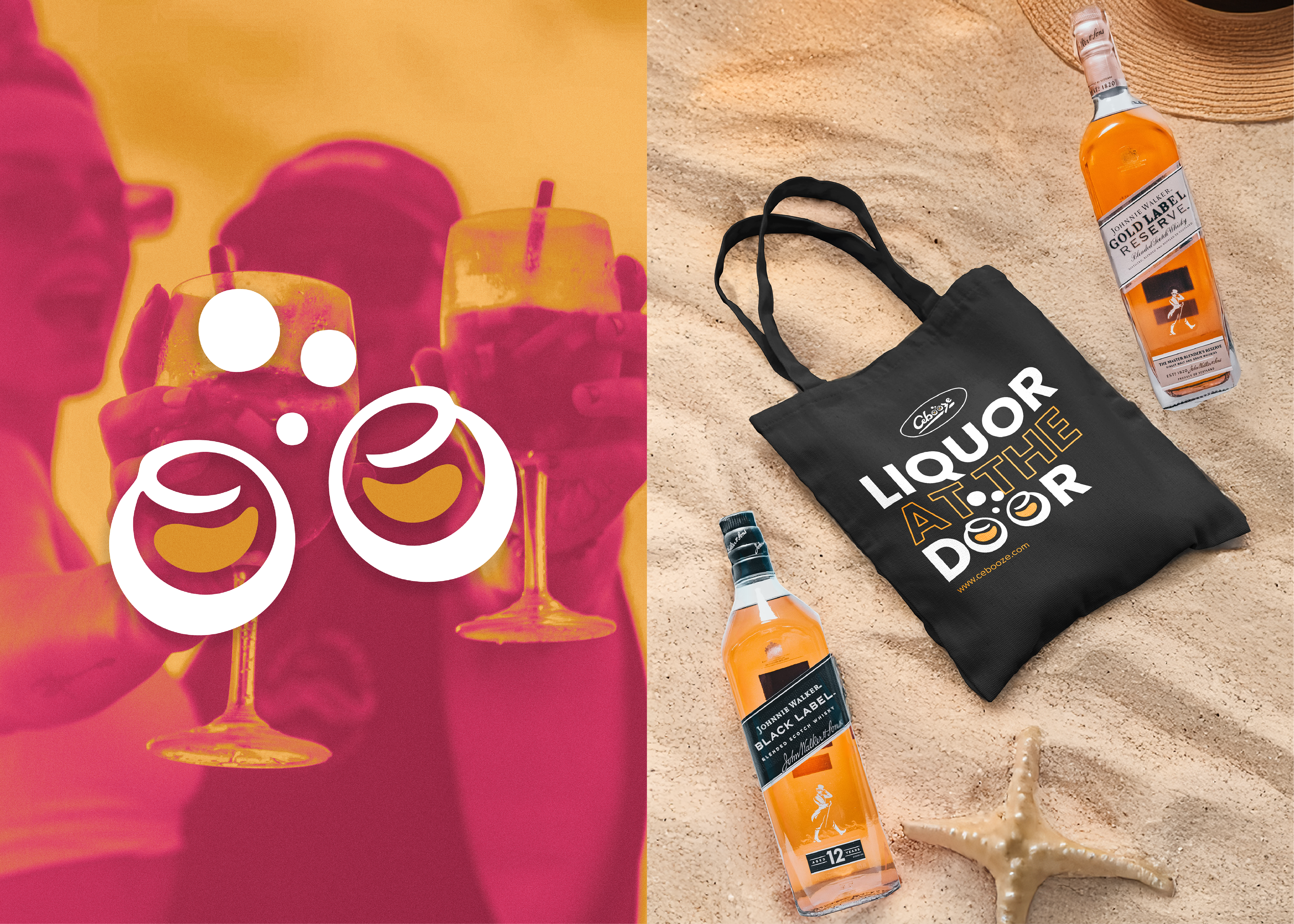
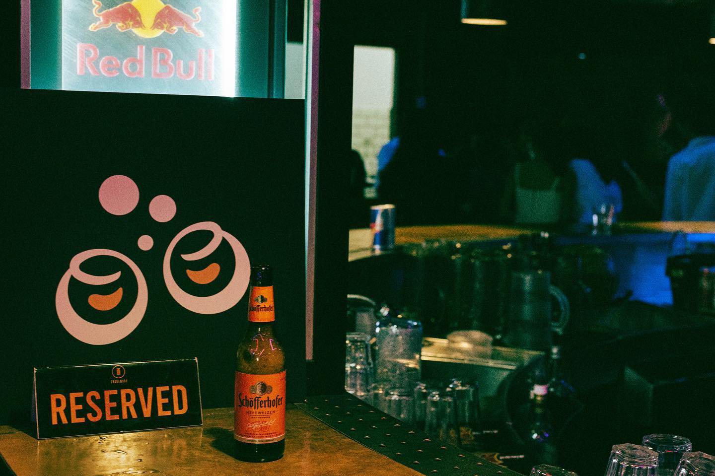
When we looked back at our findings, we realized that community is a big part of what makes Cebooze special. To show this, we designed an icon of people celebrating and raising a toast, capturing the brand’s fun, social, and connected personality.
Design Decision for the Logo
From the start of the rebrand, we knew the name Cebooze had to shine. A wordmark logo was chosen to make the brand name instantly recognizable and memorable, establishing a strong foundation for all visual communications. At the same time, we introduced a flexible and distinctive icon to complement the wordmark. This icon could be used across the website, social media, packaging, and other brand touchpoints.
When we looked back at our findings, we realized that community is a big part of what makes Cebooze special. To show this, we designed an icon of people celebrating and raising a toast, capturing the brand’s fun, social, and connected personality.

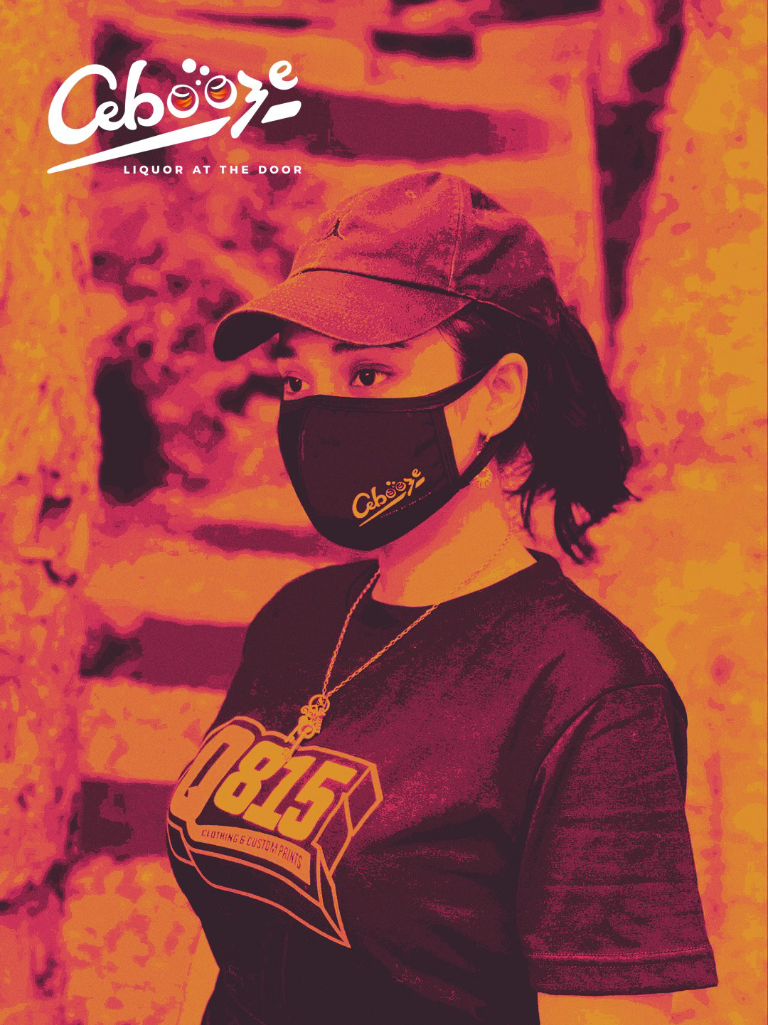
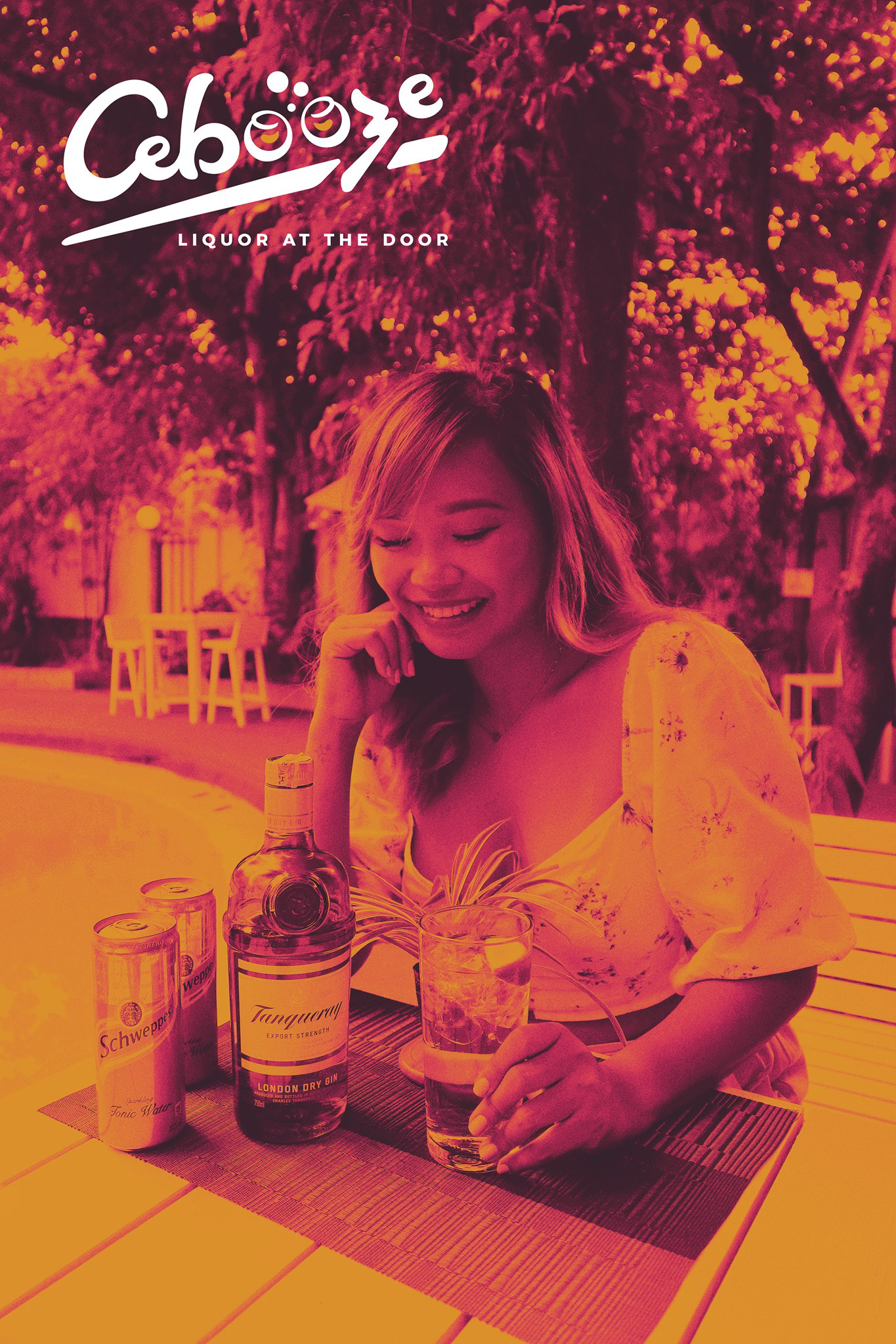
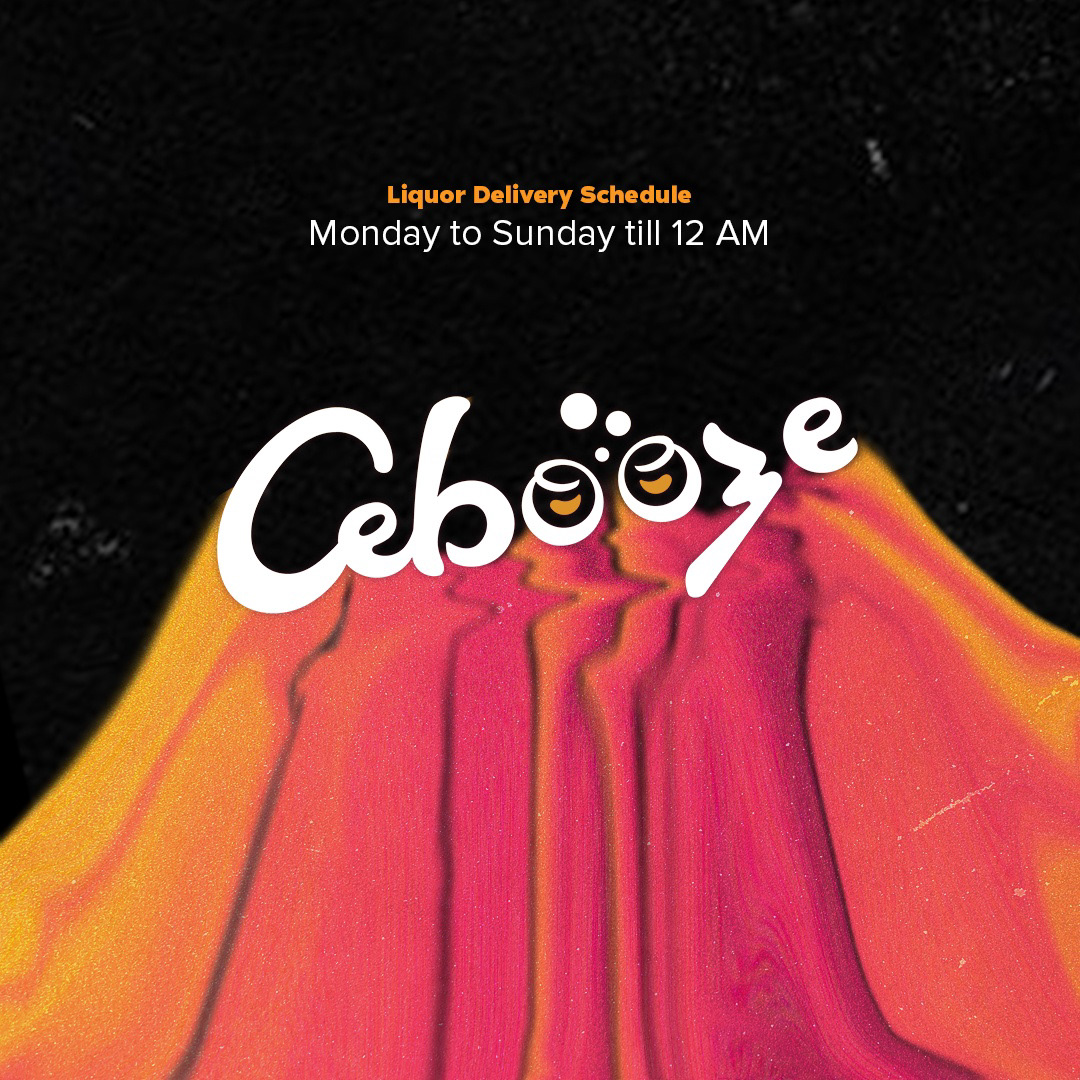
Brand Color
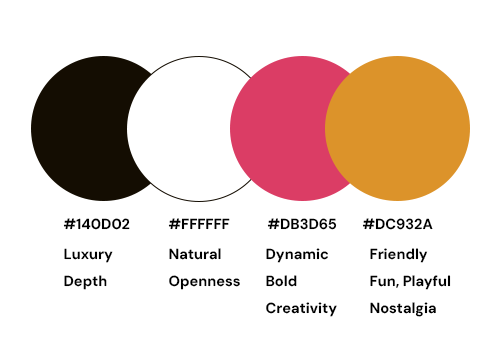
To reflect Cebooze’s fun and playful personality, we chose #DC932A (Warm Orange) and #DB3D65 (Vibrant Pink) as the main brand colours. The warm, energetic tones, reminiscent of a sunset, evoke celebration, joy, and a sense of community, perfectly capturing the lively spirit of the brand.
To reflect Cebooze’s fun and playful personality, we chose #DC932A (Warm Orange) and #DB3D65 (Vibrant Pink) as the main brand colours. The warm, energetic tones, reminiscent of a sunset, evoke celebration, joy, and a sense of community, perfectly capturing the lively spirit of the brand.

3. Iterations
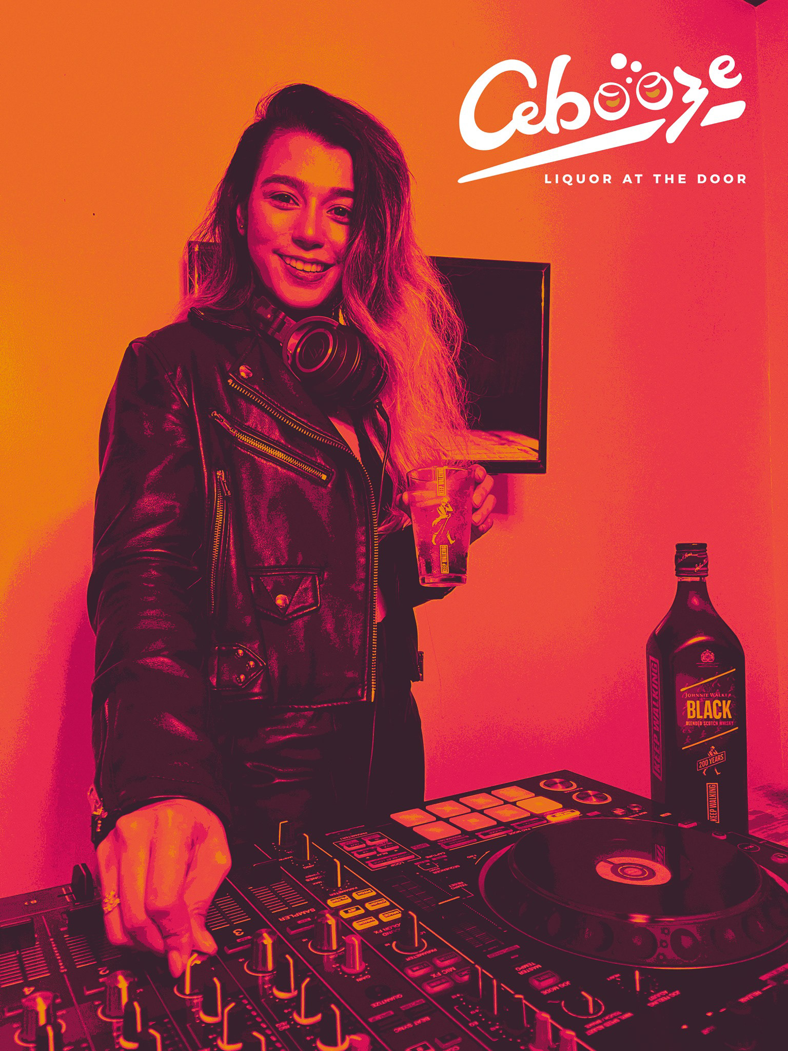
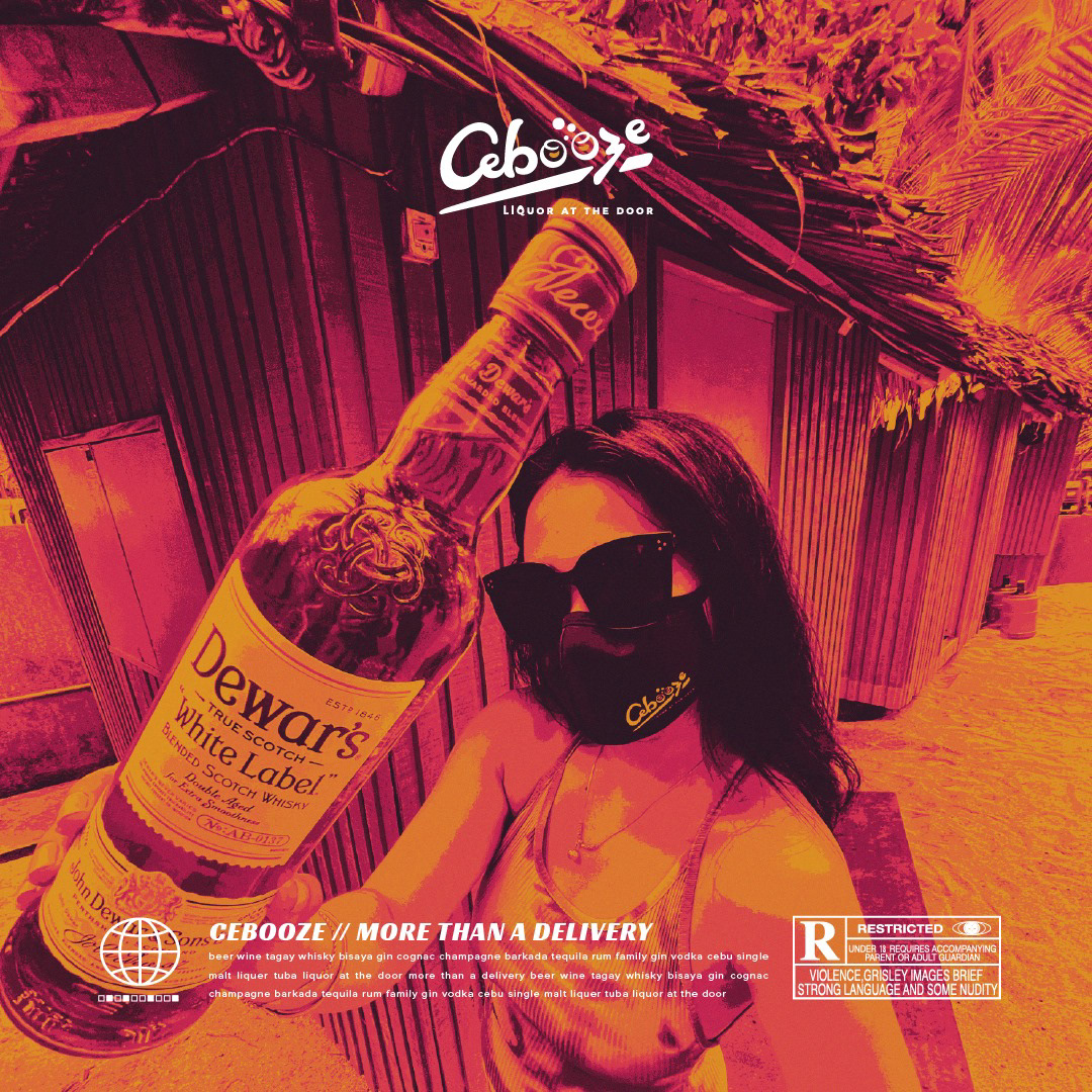
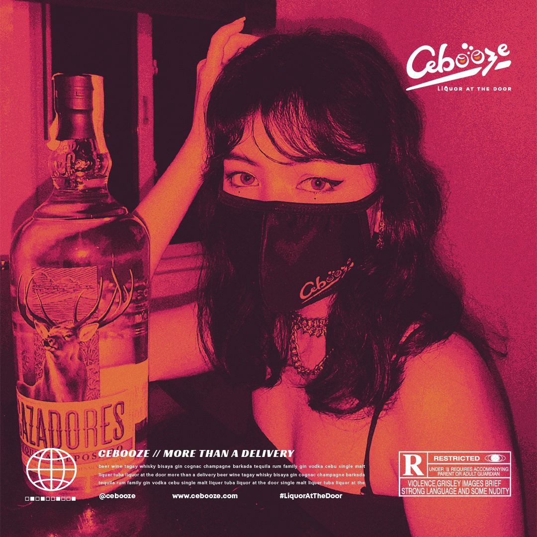
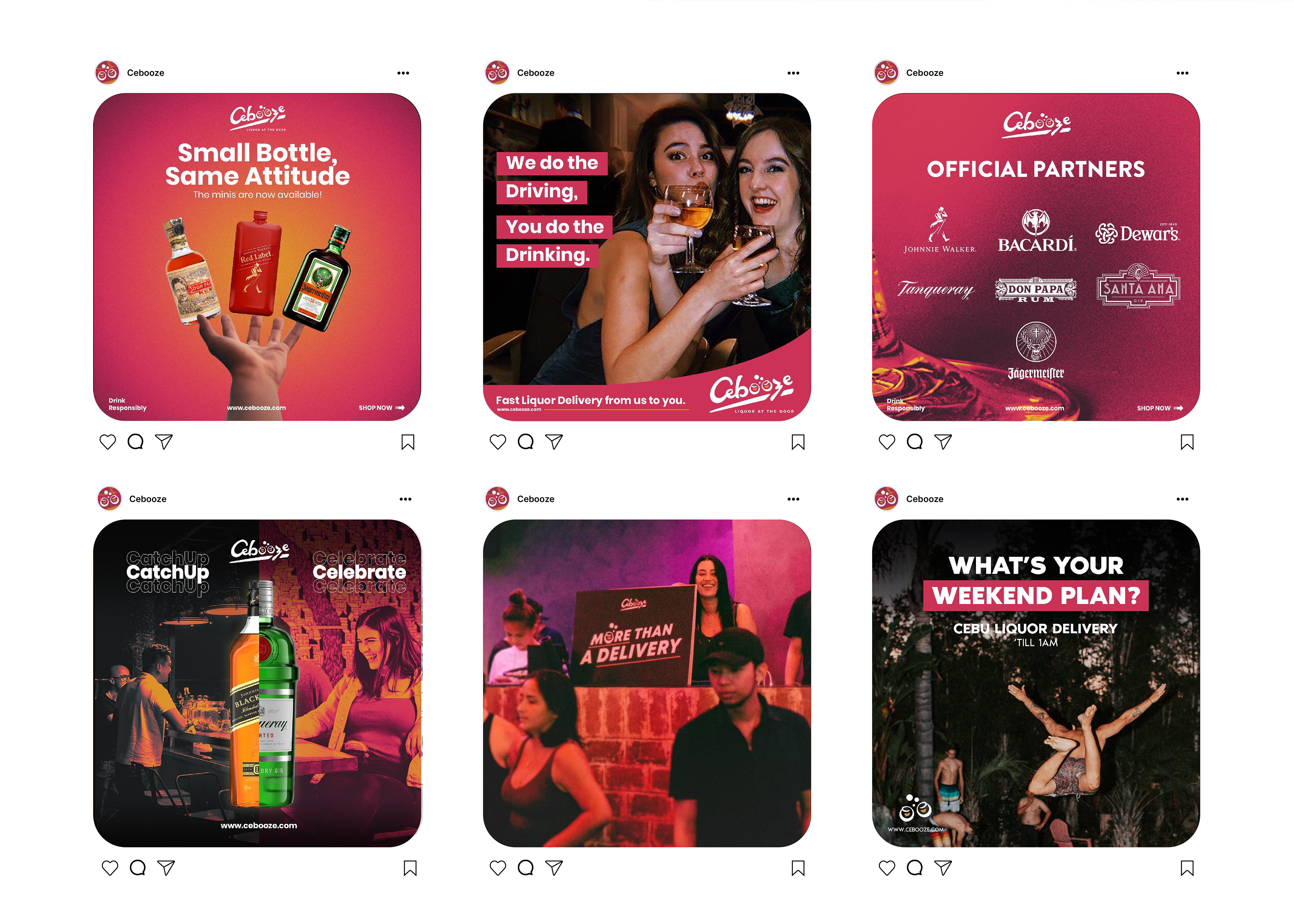
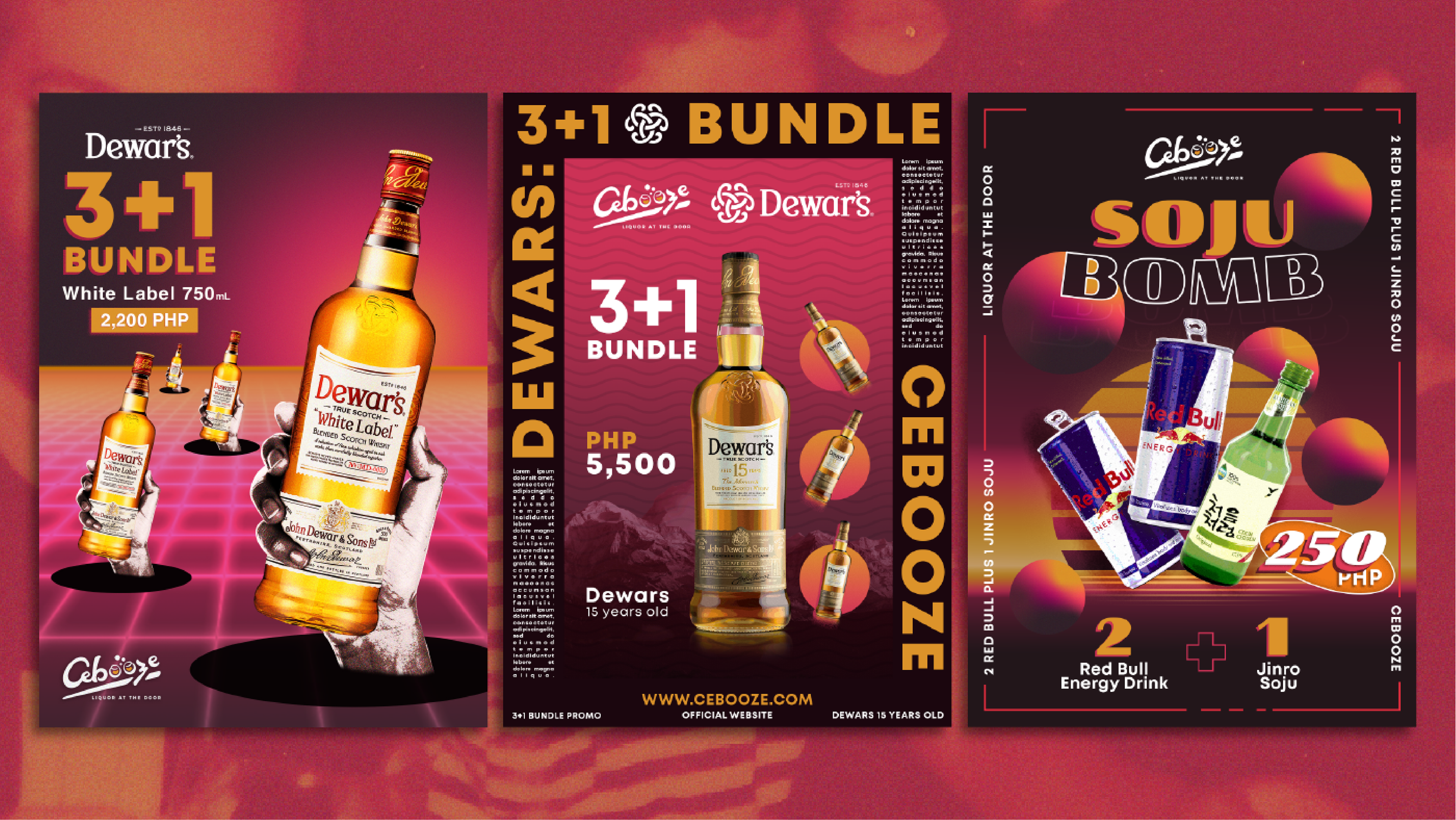
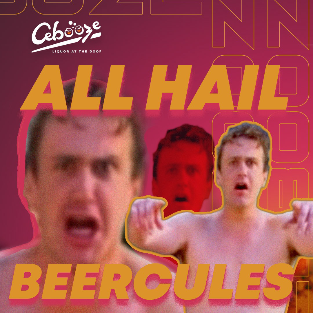
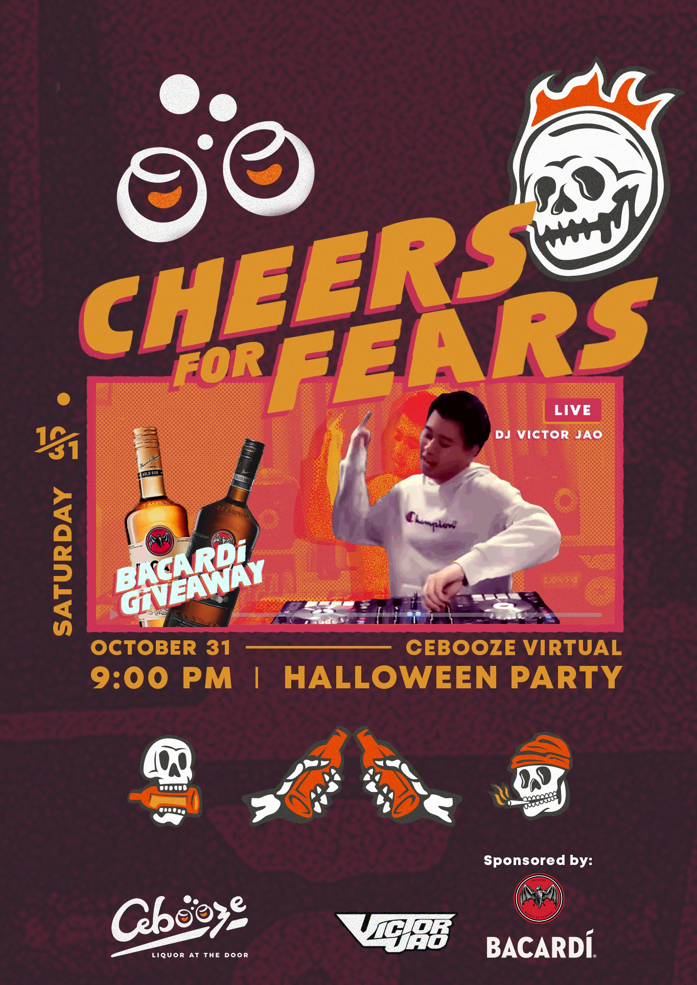
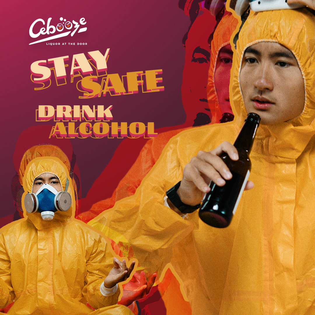
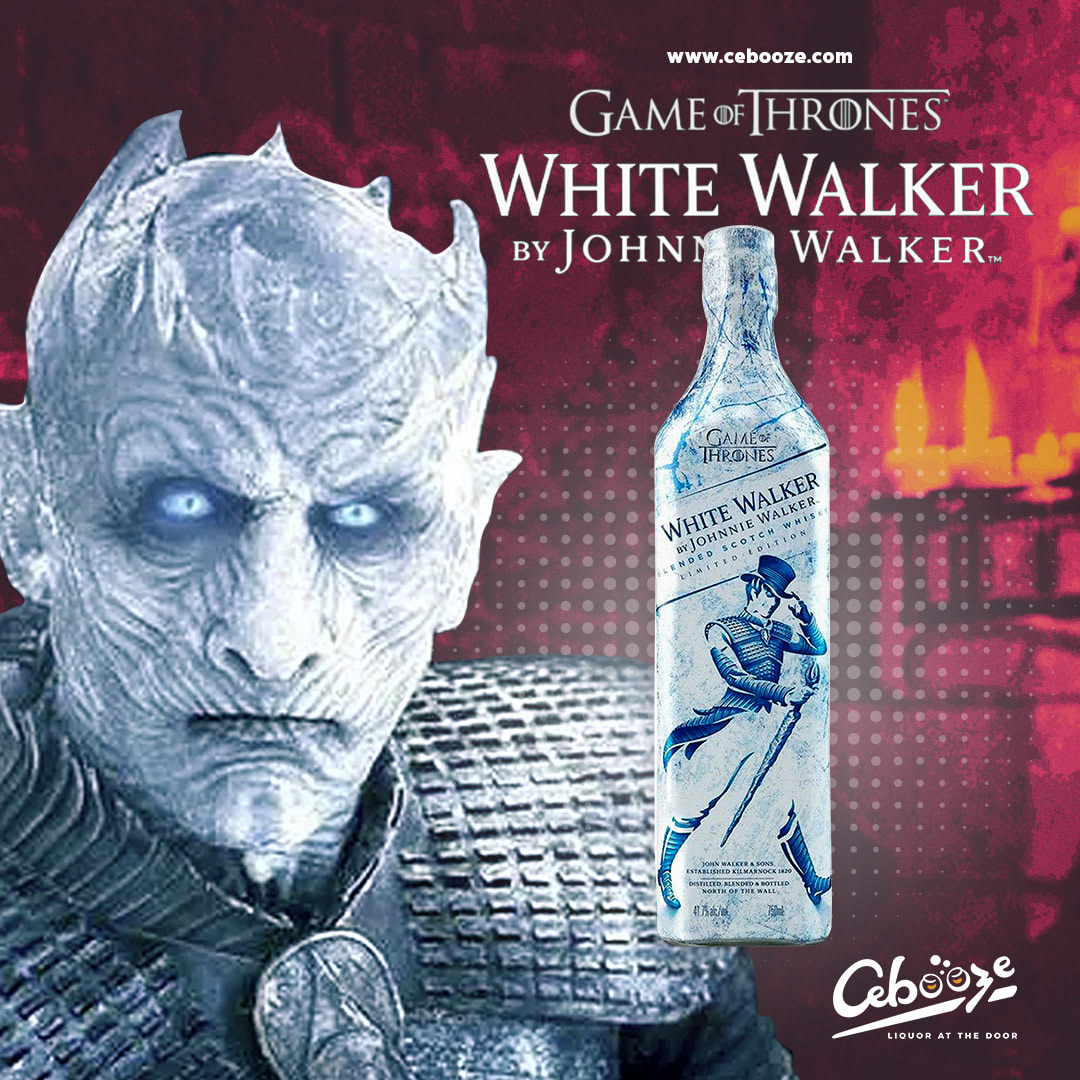
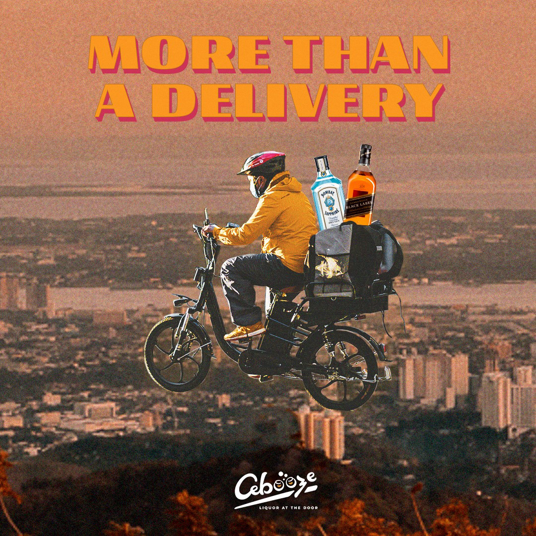
Creating a dynamic brand identity is a challenge in itself, so we experimented with typography and imagery to bring Cebooze’s visuals to life. We incorporated humour and relatable references to make the brand feel approachable, engaging, and connected to its audience. The most difficult part was finding the right balance between playful chaos and cohesive, dynamic design, ensuring the brand feels lively without losing clarity or consistency.

4. Delivery
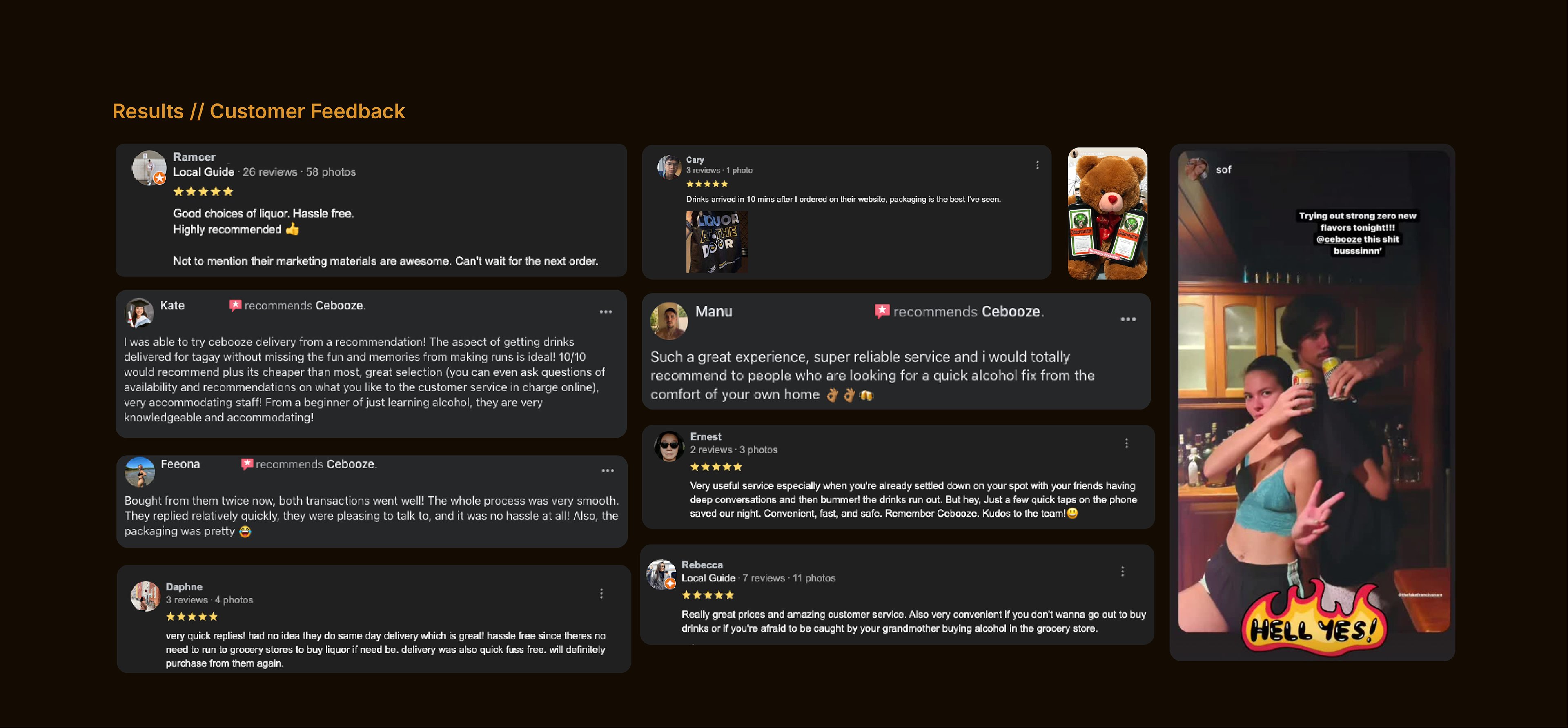
After several design iterations and careful consideration of feedback, we were able to refine Cebooze’s visuals to better resonate with the audience. Feedback helped us identify what was engaging, what felt relatable, and how to balance playfulness with clarity. As a result, the visual designs successfully captured customer attention, reinforced the brand’s fun and community-driven personality, and created a stronger connection with its target audience.